Type + Image: Expressive Lettering


Your objective for this project is to create a compelling, powerful, visually magnetic poster on the theme of anti-gun violence and/or a reaction against hate and violence in general, utilizing expressive hand-lettering and to be exhibited Dec 12, 2016 – Feb 12, 2017 in the Studio Gallery.
PROJECT DETAILS:
20″ x 30″
It should feature hand-lettering
It should be a poster “against guns, hate, and violence in youth culture”
PROJECT TIMELINE:
Mon Oct 24: Begin / Research / Sketch
Wed Oct 26: Refine sketches
Mon Oct 31: Move into Illustrator
Wed Nov 02: Work
Mon Nov 07: Group Critique
Wed Nov 09: Work
Mon Nov 14: Work
Wed Nov 16: Project Due


Sometimes, a great typeface can convey great power and even emotional content. But there are times when a conventional font just won’t do.

… this project represents one of those times.
As far as content goes, we can all agree that gun violence sucks. We can all agree that racism sucks, hate in any form is not welcome in our society. But how can you find a new and compelling way of making that clear?
A few designers always spring to mind when I think about hand-lettering: James Victore, Paula Scher, Charles Rennie Mackintosh (The Four), and a handful of others.

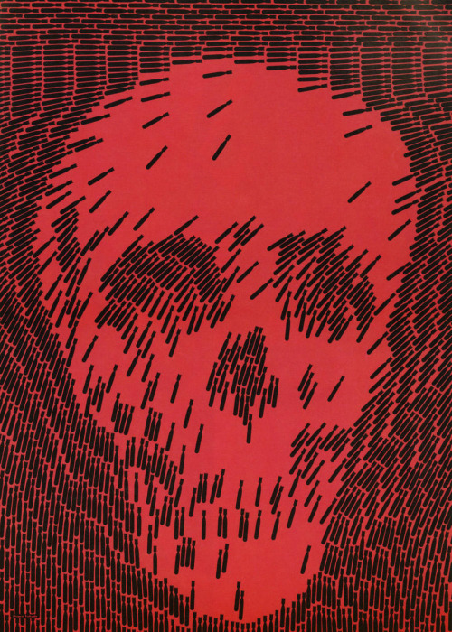
Luba Lukova doesn’t particularly need text for this poster to have a powerful message.

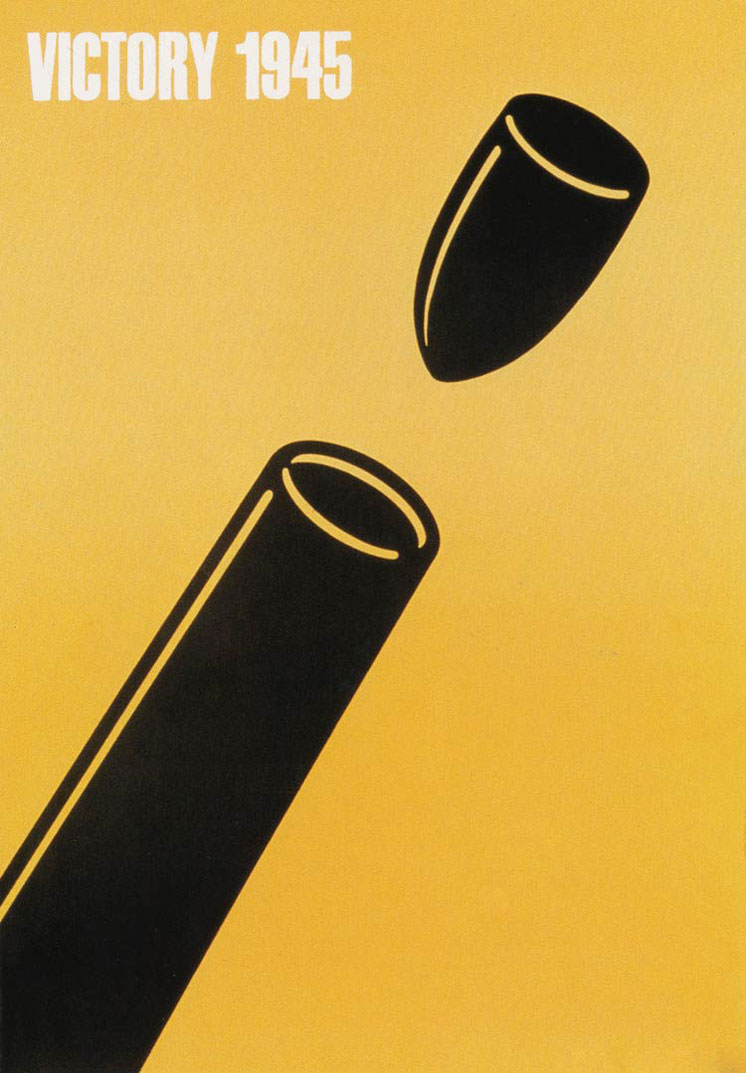
Seymour Chwast used humor in this anti-war poster…


Micropublishing: Feature Article

Your objective for this project is to design a feature article with the text provided by Em Dash. You will design the pages, and create/edit any accompanying imagery. When the project is due, you will submit two boards (one for each layout: opening and continued article), as well as a PDF of the layouts.
The final layouts will be submitted to Em Dash, and a “winner” will be selected to receive scholarship money from Em Dash.
Step 1: Research! Always! Once you’ve received the text for the article, you should read it. Then start researching the ideas discussed in the article.
Step 2: Start sketching. Use thumbnail sketches to consider layout ideas. How will those ideas affect or involve the kinds of images you want to use and vice versa?
Step 3: What about those images. Don’t use Google Images to find something and plop it into InDesign. Either create your own illustrations, or take your own photos, or somehow *make something* that is your own.
Step 4: Fire up InDesign to start laying out text and images. You may have to go through a few ideas to get the display text, body copy, and accompanying images to work together as a cohesive layout.
Project Timeline:
Mon Oct 24: Begin Project / Research / Thumbnails
Wed Oct 26: Edit Images / Start to combine into layout
Mon Oct 31: Typography
Wed Nov 02: Group Critique
Mon Nov 07: Implement changes
Wed Nov 09: Work Day / Design Philosophy
Mon Nov 14: Review work
Wed Nov 16: Project Due (Boards + PDFs)
MICROPUBLISHING: Contemporary Mythology

PROJECT DESCRIPTION
This project will be a digital/analog hybrid. We can move into InDesign to start laying out spreads, but there should still be an element of design-by-hand. That could be in the form of hand-lettering, illustration, cut paper, or something else entirely. Think back to Bootcamp Magazine,  which we looked at on the first day of class. They have a great mixture of both analog and digital elements.
The content will be based around the theme of Contemporary Mythology. What is contemporary mythology? Start out thinking about what you know about mythology in general. Historically, myths have helped people to understand the world around us when it might not make sense. Does Apollo *really* drive a chariot across the sky, pulled by fiery horses, and that’s what makes the sun illuminate our world? Probably not, but it helped people think about the sun, and how it works.
With that in mind… what could be a contemporary version of a myth that helps explain things we don’t understand? Scientific discoveries have made many of the myths we know and love seem obsolete, but they still serve their purpose. Not to mention the fact that there are still a great many things we do not fully understand.
No superheroes.
PROJECT DETAILS
20 pages (including covers)
Separate cover stock from interior pages
Your own writing/content
No color
Layout in InDesign
Some element of hand-design
PROJECT TIMELINE
Wed Oct 05 – Begin project / Research / Start writing
Mon Oct 10 – Work day
Wed Oct 12 – No official class meeting
Mon Oct 17 – Work day
Wed Oct 19 – Work day
Mon Oct 24 – Project Due
TYPE + IMAGE: MODULAR TYPE
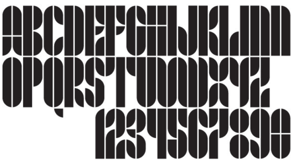
Your objective for this project is to design a creative and expressive typeface from three basic shapes. Of course, all letterform design is modular, in a way. Once you have a stem, curves, transitions, and the like, you can use those parts and pieces to create an entire typeface. That’s exactly what you are going to do, but with just a few shapes. Often, we think of the bauhaus and their heavily geometric and modular ideas. Here’s a link to a great looking workshop on modular type.

- You will begin by drawing your modules on graph paper. Try out a few different combinations of shapes. Try a circle, square, and quarter-circle. That would yield a typeface like Josef Albers’s Kombination Schrift above. Then maybe try some less geometric, more organic shapes. Then mix the two styles together to get something new and interesting.
- Then test your design by designing a series of letters and numbers with those modules. You might instinctively start out with A, B, C, etc. But that isn’t really the best way to go. Instead, start out with A, E, N, S, G, and 2.
- Next, transfer your final selection of modules to clean, white paper and carefully cut them out. Use the cut out shapes to create upper-case A through Z, and 0 through 9. Trace the shapes with pencil and fill in with marker on white paper.
- Scan the results of your tracing and markering and digitize in Illustrator.
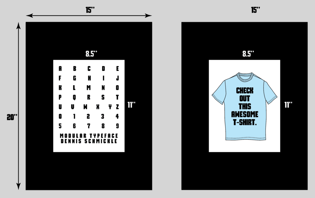
- Design something (not a poster) with your new typeface. Of course, this typeface will function as a display typeface, rather than something like body copy. And you will not be able to install a font file and type with it. BUT, you can still set headlines or a logotype with it by dragging letterforms around in Illustrator.
- When that is finished, you will print and mount two sheets of paper on two 15″ x 20″ boards. One will be your new typeface: A-Z, 0-9, the name of the typeface, and your name set in that typeface. The other is the thing that you designed with that typeface. (Put you name and class on the back of the boards) See below…
PROJECT OBJECTIVES
- Design with your hands
- Design a typographic system
- Implement a creative typographic solution
- Analyze typographic design processes
PROJECT TIMELINE
Mon Oct 03
Draw shapes (modules) on graph paper
Test by designing characters with those modules on graph paper
Wed Oct 05
Guest speakers!
Mon Oct 10
1. Transfer and cut out graph paper character drawings from white paper
2. Create A-Z and 0-1 from modules by tracing with pencil and filing in with sharpie on white paper
Wed Oct 12
Scan results to digitize and redraw in illustrator
Mon Oct 17
Set type with vectorized letterforms (Not a poster?)
Wed Oct 19
Continue designing with new typeface
Mon Oct 24
Turn in 15”x20” black mat boards: One with A-Z, 0-9. One with the thing you’ve designed.
PROJECT COMPONENTS
• 15” x 20” board with A-Z, 0-9, name of typeface, and your name
• 15” x 20” board with example of design with your typeface
• Project Notebook
EXAMPLES


