
SYLLABI
GD 120 – Introduction to Graphic Design
GD 306 – Digital Imaging
GD 308 – Digital Illustration

Project details and other notes

You made it! This is the FINAL project!
And as previously discussed in class, you’re in charge. You determine the content, page-count, images, etc.
However, there are some expectations:
This project should be ambitious, creative, and a culmination of what you’ve learned not only in this class, but also in Typography, Type + Image, and Publication. Pay attention to type size, margins, and image quality.
And, of course, there should be a solid concept upon which you build the entire project. What is the story you want to tell? What is the subject you want to address? Why should someone pick up this book and read it?
DUE WED DEC 7
For your FINAL PROJECT in Type + Image:
You will pick a haiku at random from the mystical haiku bowl.
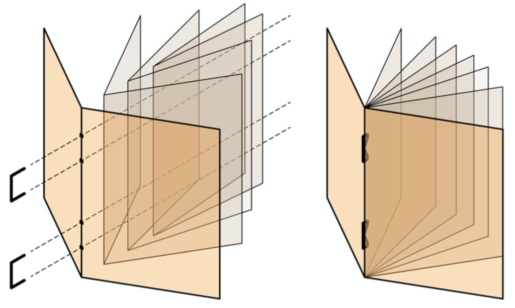
Your task is to reinterpret the haiku as a small, 8-page booklet. You must design the front and back covers, as well as three interior spreads.
You may use any kind of typography you would like to tell the story. All words in the haiku must be used, but no other words. However, you may repeat words or phrases. Imagery can be used freely to compliment the typography. The kind of imagery, i.e. found images, photography, illustration, etc. is up to the designer. However, they must be appropriate resolution and quality. No pixels! There are no color limitations.
OBJECTIVES:
PROCESS
You will be required to maintain thorough documentation of your process throughout this and all assignments in this calss. Keep a collection of everyting pertaining to this project (research, sketches, copies, etc.) and bring it to each class meeting. This collection will be turned in at the completion of this assignment and will be part of your final grade.
PROJECT COMPONENTS:
PRESENTATION:
6″ x 6″ booklet, including covers and 3 double-page spreads
PROJECT TIMELINE:
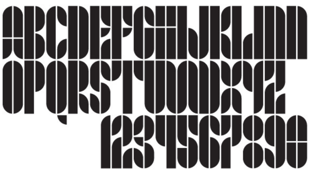
Your objective for this project is to design a creative and expressive typeface from three basic shapes. Of course, all letterform design is modular, in a way. Once you have a stem, curves, transitions, and the like, you can use those parts and pieces to create an entire typeface. That’s exactly what you are going to do, but with just a few shapes. Often, we think of the bauhaus and their heavily geometric and modular ideas. Here’s a link to a great looking workshop on modular type.

PROJECT OBJECTIVES
PROJECT TIMELINE
Mon Oct 03
Draw shapes (modules) on graph paper
Test by designing characters with those modules on graph paper
Wed Oct 05
Guest speakers!
Mon Oct 10
1. Transfer and cut out graph paper character drawings from white paper
2. Create A-Z and 0-1 from modules by tracing with pencil and filing in with sharpie on white paper
Wed Oct 12
Scan results to digitize and redraw in illustrator
Mon Oct 17
Set type with vectorized letterforms (Not a poster?)
Wed Oct 19
Continue designing with new typeface
Mon Oct 24
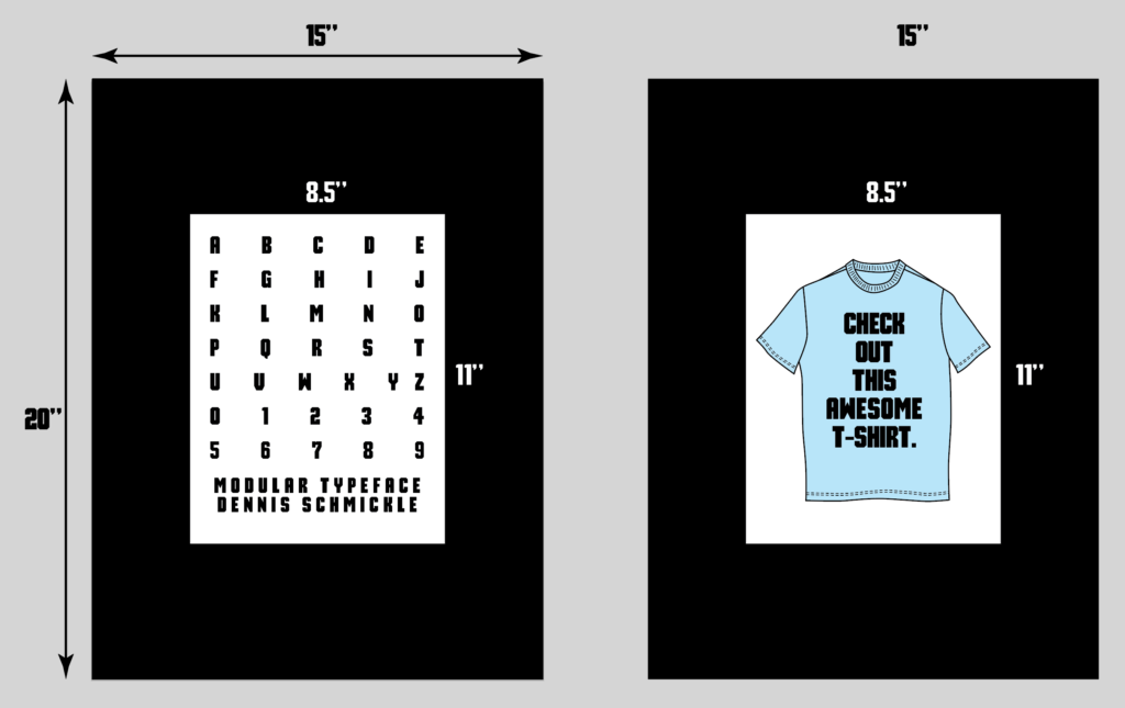
Turn in 15”x20” black mat boards: One with A-Z, 0-9. One with the thing you’ve designed.
PROJECT COMPONENTS
• 15” x 20” board with A-Z, 0-9, name of typeface, and your name
• 15” x 20” board with example of design with your typeface
• Project Notebook
EXAMPLES


