Type + Image: Dia de los Muertos Poster
 Process:
Step 1: Research the Mexican holiday, Dia de los Muertos, or “Day of the Dead.” Learn as much as your can about the holiday, it’s meanings, customs, traditions, history, symbology, etc.
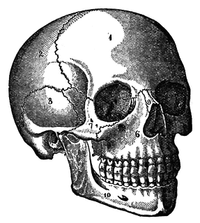
Step 2: Visit this collection of grave stones. Choose an interesting vintage tombstone epitaph to interpret typographically. Don’t forget the typographic experimentation from the two previous assignments.
Step 3: Find a vintage illustration(s) or etching that is a public domain, or non-copyrighted image. There are many, many resources on the internet…
Your task is to combine the chosen text and imagery to create a poster to celebrate the spirit of Dia de los Muertos. You may use no more than three (3) typefaces. You may use three (3) base colors, but can utilize blending modes and opacity to create others. Use letter-spacing, leading, point size, etc. freely to convey the message. Use all of the type from the headstone. The basic rules of typography such as horizontal scale, baseline, alignment, etc. are of little to no concern for this assignment. Be creative!
Objectives:
- increase your ability as a planner and form giver
- develop an awareness of the relationship between design and meaning
- increase and improve the quality idea generation (quality & quantity)
- increase conceptual skills
- increase your understanding and appreciation for typographic subtleties
Working Technique:
Draw ideas from photo references to establish spatial design relationships. Look at your text “creatively.” Find unique ways to represent your subject matter through photography, diagrams, illustrations, etc. Look at scanning techniques and drawing techniques to enhance your image selection. Research definitions, charts, graphs, etc. for unusual approaches for information graphics for your subject.
Suggestions: Evolve your thumbnail sketches into workable drawings for execution (concentrate on simplicity and stylization). Carefully consider artwork and photo characteristics (line weights, positive and negative shapes, etc.) as you begin. Work with the principal of “overlap” and create a strong visual hierarchy for your poster. Consider blending images to create new compositions.
Process: You will be required to maintain thorough documentation of your process throughout this and all assignments in this class. Keep a collection of everything pertaining to this project (research, thumbnails, sketches, illustrations, copies, etc.) and always have it with you. This collection will be turned in at the completion of this assignment and will be part of your final grade.
Project Components:
- one 11×17 color print (unmounted) at due date
- one hi-res digital version saved as a jpg or pdf
- one process folder (digital or physical)
Deadlines:
- Oct 1 – Begin assignment: Research, brainstorm, sketch
- Oct 6 – Have 10-12 loose sketches/thumbnails
- Oct 8 – Three computer comps due
- Oct 13 – Critique / Revisions / work day
- Oct 15 – Revisions / work day
- Oct 20 – Prints, digital version, and research documentation due
Type+Image: Typographic Rhythm
Just as music has rhythm, so to does typography. Good type has soul, feeling, emotion, beat, tempo. Type can be happy or sad, meaningful or silly, disturbing or inspirational. A good song effects you in some way, so should good typography. It can be fast paced or slow paced, upbeat or melancholy. Learning to understand the rhythm of type is essential to a graphic designer.
You will each be given a song. There are many styles available. Listen to the lyrics.
Your task is to interpret the feel of the song using ONLY typography. It can have visual meaning, but this must be accomplished with type. Using only lyrics from the song, typeset and choose typefaces that seem fitting. Use as much of the lyrics as is necessary to achieve the feeling you wish to convey. You may use no more than two (2) typefaces. You may use multiple weights and variations of the same typeface, i.e. italics, small caps, etc. Use letterspacing, leading, point size freely to help convey the message. The basic rules of typography such as horizontal scale, baseline, alignment, etc. are of no concern for this assignment. BE CREATIVE. Think of yourself as a visual conductor.
There are no color limitations on this assignment.
- OBJECTIVES
• to increase your ability as a planner and form giver
• to develop an awareness of the relationship between design and meaning
• to increase and improve the quality idea generation (quality & quantity)
• to increase conceptual skills
• to increase your understanding and appreciation for the subtleties of typography
PROCESS
You will be required to maintain thorough documentation of your process throughout this and all assignments in this class. Keep a collection of everything pertaining to this project (project sheet, research, sketches, thumbnails, copies, etc.) and bring it to each class meeting. This collection will be turned in at the completion of this assignment and will be part of your final grade.
PROJECT COMPONENTS
• one 11″x17″ print
• one process notebook
PRESENTATION
• The finished print will be mounted on a 15″ x 20″ Black board
Critique: Thur Sept 24
Due: Thur Oct 1
Choose from these songs:
Johnny Cash – Folsom Prison Blues
Queen – Bohemian Rhapsody
Run-DMC – Tougher Than Leather
Talking Heads – Psycho Killer
Run The Jewels – Run The Jewels
M.I.A. – Bad Girls
Marty Robbins – El Paso
ABBA – Voulez Vous
The Rolling Stones – Paint It Black
Public Enemy – Fight the Power
Type+Image: Assignment 01
TYPOGRAPHIC SYSTEMS AND VISUAL LOGIC

The objectives:
- to learn that an infinite number of possible solutions exist for each problem.
- to use typographic variables to create typographic color and hierarchy.
- to demonstrate an understanding of alignment.
- to use alignment to create structure and cohesiveness in a layout.
- to develop a sensitivity towards the subtleties and nuances of typographic variables
The process:
1. select a block of text from below.
2. explorations address a number of changing parameters (as follows):
Set 1:
- select one typeface (must have a regular and bold weight)
- use the regular weight only
- use only lowercase letterforms in 8 or 9pt size, but not both
- experiment with leading and alignment only.
- vertical or horizontal use of type only.
Set 2:
- select one comp from set one, you may vary letterspacing, weight and use small caps where appropriate.
Set 3:
- select one comp from set two, you may vary point size (6pt-14pt), you may bleed letterforms, italics, u/lc, angled
Set 4:
- select one comp from set three, you may vary your point size (unlimited), overlap letterforms, use counter changes, etc.
Notes:
- all work must be produced on 8.5 x 11 inch paper, live area is contained within a seven by seven inch RULED box
- type direction (horizontal, vertical) unless otherwise noted. (if you angle your type be very sensitive to aesthetic qualities.)
- do not under any circumstance make literal shapes (i.e. a cow if the type is talking about cows, etc.)
- do not use graphic elements (bullets, bars, rules, etc.)
- make sure the font you select has a bold weight!
- use serif or san serif
- do not use scripts or display fonts
- do not use color (i.e. red). create typographic color instead
- carefully follow the parameters for each step, read!
- think – series, sequence, development
Deadlines:
Set 01: Six Comps Due Tue Sept 1
Set 02: Six Comps Due Tue Sept 8
Set 03: Six Comps Due Tue Sept 15
Set 04: Six Comps Due Thr Sept 17
The texts:
01:
You walk around with a load of nitroglycerin in your head, you mix that with some other random chemicals, everyday life and love at first sight and you get some highly combustible stuff swimming around in there. And then things change, shifting faster then you could ever possibly catch up with. And you find yourself using highly advanced communication devices. The more advanced the device the less you seem to communicate. It’s a shame really as communication become faster and more accessible we seem to be losing the ability to understand each other. Your brain makes you the victim of too much information and too many choices, and you lose your self, you fall in love and it breaks your heart. So you lay down on the floor and watch the ceiling spin round and round. Reminding yourself to keep breathing.
02:
To puncture and fracture the mediocre and redefine the design of the undefined. Intertwine my mind with yours, united by my chosen words and transpose our progress to forward from reverse. I’ll propose an oath and promote the growth of all the thoughts of different folks inhabiting one earth. To suppose that one can learn on their own is not absurd, but to teach another offers opportunities for new knowledge to be learned. So I open my head and share my intellect in hopes for you to accept not reject the pictures I direct and colors I select that project a portrait that reflects my past, future and present. You can teach, I can learn, I will share with you what I’ve earned. Together we are more, because when alone, there’s not much to learn on our own.
03:
I’ve seen color collisions and rippled effects of broken rainbows collapsing into the blueness of eternity. Paths intertwined and spit from indifferent ruin of miss shaped realism and fragmented words that remain unspoken. A walking misunderstanding-cry your foreign tears and let me translate them into hearts-and pretty purple things that float. Act as if it’s all okay, because it is, isn’t it? And if it isn’t, there would be no sense in saying otherwise, less mountains are moved by our apathy. And they’re not-by the chiming of wristwatches. They’re not-by a huddled prayer and bit lip. They’re not-by the thousands of earth-shattering devastations-the root of all inexorable pain and the basis of the god damn problem.
04:
Can you hear me screaming as internal organs flail in a diseased corrosion of written instructions replaced with poetic words and actions. Chopping away at layers of superfluity, strength in numbers, screams the army of vagabonds but the morning newspaper doesn’t have compassion. Type written words-concise in the corner of page eleven’s obscurity. Can I come inside, wait till the storm blows over? Rest aching limbs for awhile-and see you through shattered glass windows-no more. Let air flow freely through pursed lips, may beauty whisper in your ear of broken promises and abandoned engagements. Let me take you home-to the cottage of contemplation. So words spin around and around my kitchen table in creation of morning’s myth. Yes, let us dine and embrace the entirety of all that rests quietly on china plates. Take my hand-come if you wish. Wipe away withdrawal-so that the ocean’s early morning sacrifices lie neatly on your dresser drawer.


