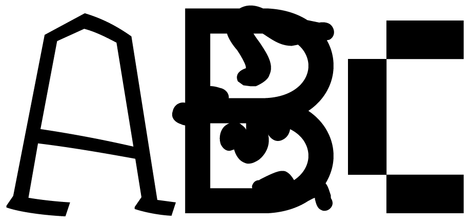
Your final project in Type + Image has a number of components.
- You will design a custom typeface (Doyald Young)
- Give your typeface a concept (ZXX)
- Design 2 variations (italics, bold, interference, etc)
- Design Upper and lower case, numbers 0–9, punctuation (Illustrator, PDF)
- Any extra glyphs/ligatures you might want to add (OPTIONAL)
- Design a specimen booklet for your typeface (House Industries)
Objectives
- Create and implement an original typeface
- Create conceptual typography
- Develop an awareness between aesthetic and conceptual concerns in type design
- Increase conceptual skills through research
Project Components
- 11″x17″ print of your typeface on black matboard (simple, nothing interesting)
- Specimen Booklet (dimensions variable) presented on black matboard
- PDF of full font
Deadlines
Tue Nov 10: Begin research and initial sketches
Thr Nov 12: Review research and sketches. Digitize sketches.
Tue Nov 17:
Thr Nov 19:
Tue Nov 24:
Tue Dec 1:
Thr Dec 3:
DUE: Saturday, December 5 at 4:30 p.m.
Ok, so what is meant by “concept” in this case? ZXX is a heavily conceptual typeface. It was designed with a specific purpose in mind, and that purpose heavily influenced how it looks. San Francisco is another font with a particular purpose. Why does it exist? Knockout and Gotham are two typefaces with historical context. How can you interject some kind of specificity into your particular alphabet?
Then, how do you advertise your creation? For whom is it intended? Can you create materials that will speak to that audience, and shine the best light on your typeface?
Check out this (now tragic) short documentary about Hoefler & Frere-Jones:
Font Men – SXSW 2014 Official Documentary Short Selection from Dress Code on Vimeo.
Start with letters O, H, and D. Erik Speikermann starts with A, N, E, S, and G. Then move on to characters composed of all straight lines: E, I, T, etc. Then, how do you deal with curves… such as the letter S, g, the ampersand (&), and the other sundry characters that make up a full set?
And if you’re going to start designing type, it behooves you to familiarize yourself with some type designers:
- Hermann Zapf
- Adrian Frutiger (typefaces)
- Neville Brody
- Jonathan Barnbrook
- Tobias Frere-Jones (typefaces here and here)
- Typographica
- Font Bureau
- Emigre (Zuzana Licko)
- Susan Kare
- House Industries
The Art of Hermann Zapf from Johnny Dib on Vimeo.
House Industries: Interview with Ken Barber from Gestalten on Vimeo.

